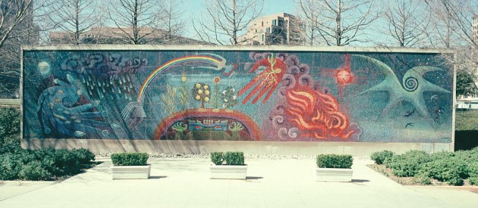
As you walk toward this striking mosaic by artist Miguel Covarrubias, invite your tour participants to look at the boundaries between regions of color in the mosaic, and identify one high-contrast boundary and one lower-contrast boundary. Then, invite the participants to come up very close to the mosaic and examine how the tiles look in the vicinity of each of the boundaries that they identified. They should see that at the high-contrast boundary the edges of the individual tiny tile lie right along the boundary, whereas at the low-contrast boundary, the tiles don’t seem to have any special relationship with the boundary and that up close, the boundary may seem to “dissolve” and be very hard to pin down a precise location for, even though the boundary was clear from far away. These observations show how the macroscopic characteristics of the image affect the microscopic characteristics of the tiny tiles that make up the image. As we’ve discussed with Spirit Inner Columns or the square stones making up the contours of the earth in earlier stops, the study of how macroscopic form connects with microscopic structure is one central and very powerful theme in mathematics, and we can appreciate it here in understanding how a mosaic artist creates different features in his work.
Before you step away from the close-up view of the mosaic, have the participants look at one region of fairly uniform color and examine it closely. Then have them step far back from the mosaic, say under the awning of the entrance to the museum, and look again at the same region of the artwork. From here, the region should look like a uniform patch of color, whereas up close you could see that there were individual tiles of different colors. The colors have blended to create just the shade the artist desired. Sometimes we call this “adding” one color to another. Is this a kind of adding that we can understand mathematically, or is it just a sort of analogy? Actually, it is something that we can make mathematical models of. An old and fairly simple model is an artist’s color wheel, such as this one. 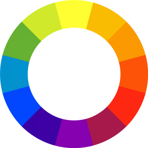
You can interpret this wheel as representing colors with angles around a circle; and if you want to find the result of adding two colors, you take their angle bisector. For example, yellow is at 90 degrees and blue is at 210 degrees and the green you get by mixing them is halfway in between, at 150 degrees. There are many more combinations that work this way as well, such as yellow at 90 degrees mixing with orange at 30 degrees to produce marigold at 60 degrees.
But as with any mathematical model of the real world, this angle model of color has its limitations; it can be pushed to a point where it begins to break down. For example, consider combining yellow at 90 degrees with purple at 270 degrees. That’s a straight angle in this diagram, so immediately you have a question of which of two equally plausible angle bisectors you ought to use, the left or the right? And further, neither really seems to give a satisfactory answer; it seems dubious that yellow and purple would combine to make either red-orange or cyan.
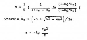
But also as with any model, you can investigate more deeply and refine it further, possibly at various levels of depth and detail. So for example, if you are building a color printer, and need to determine just how much of each color of toner to use to reproduce the color that the computer user wants to see on the printout, then you’re going need a more precise model of color combination, such as the Kubelka-Munk equation, shown below. While we’re not going to go into the details of this equation here, it serves to illustrate how math is a tool that can be used to model and understand the world around us in a huge variety of ways and at a great range of levels, touching on nearly every aspect of life, including the aesthetic and artistic worlds.





what kind of materials did Miguel use for the gift of life painting?